Creating an accessible and inclusive website for all users is a shared responsibility. That’s why, below, you’ll find the steps that will help you review your website and ensure it is accessible for people with visual impairments.
Before designing, clearly define what information your site will include and how it will be organized. A logical structure helps users who rely on screen readers to navigate easily.
Recommendation: Use a consistent, hierarchical information architecture.
STEP 1: PLAN YOUR CONTENT AND STRUCTURE
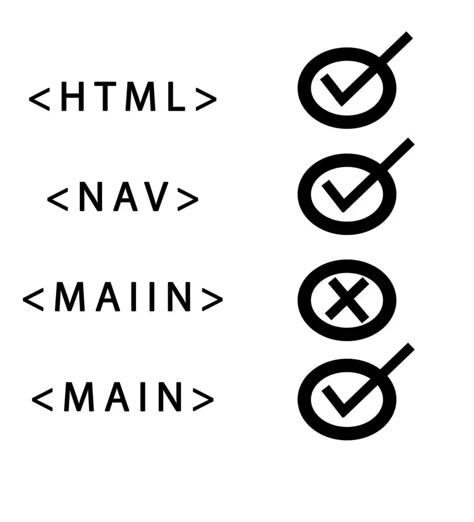
STEP 2: USE SEMANTIC HTML
Correct use of HTML tags (such as <header>, <nav>, <main>, <footer>, <section>, <article>, etc.) allows screen readers to properly interpret the page’s structure.
Example: Use <h1> for the main title, <h2> for subtitles, without skipping heading levels.
Every meaningful image must have an alt attribute that describes its content. This helps visually impaired users understand the image’s purpose.
Note: Decorative images should use alt=”” so that screen readers can skip them
STEP 3: PROVIDE ALTERNATIVE TEXT FOR IMAGES
STEP 4: ENSURE KEYBOARD ACCESSIBILITY
The site must be fully navigable using only the keyboard (tab, enter, arrow keys). Avoid relying solely on mouse interactions or complex gestures.
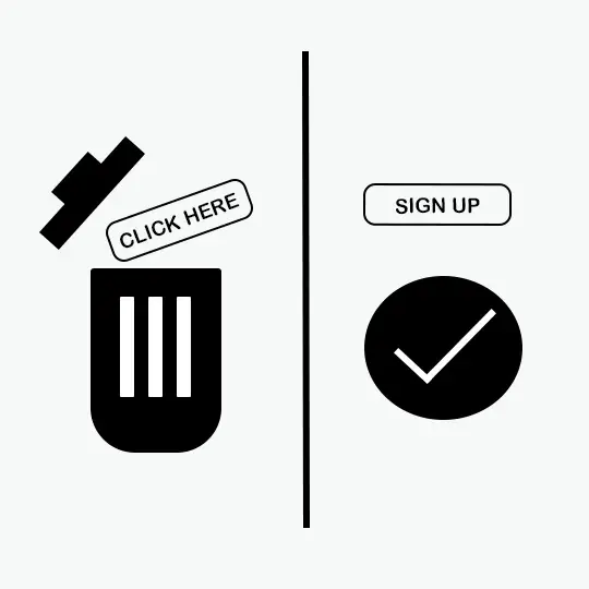
Avoid generic phrases like “click here.” Links and buttons should clearly describe their function or destination.
Example: Instead of “See more,” use “See more about our services.”
STEP 5: USE DESCRIPTIVE LINKS AND BUTTONS
STEP 6: PROVIDE ALTERNATIVES TO MULTIMEDIA CONTENT
All video or audio content must include captions, transcripts, or audio descriptions for users who cannot see or hear the content.
Avoid cluttered layouts. Use simple menus, clear icons, and a clean visual structure. This supports orientation and usability, especially for users with low vision.
STEP 7: MAINTAIN A CLEAR AND CONSISTENT DESIGN
STEP 8: ENSURE TEXT READABILITY
Use sans-serif fonts, appropriate sizes (at least 16px), and sufficient line spacing. Avoid large blocks of text.
Note: Also ensure proper color contrast between text and background (e.g., dark text on light background) to enhance readability for users with low vision or color blindness.
Use screen readers such as NVDA or VoiceOver to verify that content is presented correctly and in a logical reading order.
STEP 9: TEST THE SITE WITH ASSISTIVE TECHNOLOGIES
STEP 10: EVALUATE ACCESSIBILITY USING AUTOMATED TOOLS
Use tools like WAVE or Axe to detect common accessibility issues and get suggestions for improvement.